Designing for the Web
Oct 15, 2014
Designing for an ever changing medium like the web holds many challenges. Technology moves so fast it’s easy to fall behind and not cover all the bases necessary to make a site all it needs to be in 2014. Responsive Web Design, Retina Displays, New Device Types etc. These new technologies are what keep the web moving forward and getting even better. That is also what keeps us on our toes and having to continue tweaking and changing our process to make sure we provide the best products we can.
Our Pre-Design Process
No matter how our ‘design tool’ may change or the technology the requires it, our initial project process seems to be very resilient to change. We meet with the client to discuss the project, the goals, expectations, what is working for them currently, what needs improvement and how we can best help them.
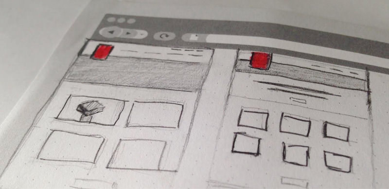
After this initial meeting and working out some site architecture and features, I will begin with some preliminary wireframing on paper. I find this is by far the quickest and most effective way to test out ideas and work on further evolving them. After working out some layout ideas I like to use Style Tiles to create an outline for the visual elements of the site. Depending on the client I sometimes use this as an internal process, other times we share this with the client to collect some initial feedback.
From here our process has splintered over the last year or so depending on the client, project, time-line and any other number of factors.
How we were working / Our previous design process
For quite a long time after our pre-design stage we would design everything in Adobe Photoshop, as most shops did. This allowed us to serve up fully fleshed out compositions for client review and approval. This worked okay for the most part but as new technology was becoming more widely adopted this method of designing became outdated in our view and it became more and more work to use this tool. The reason for this is not any issue with Photoshop, designers have been stretching Photoshop’s functionality to fit our means for some time and I think we just got to a point where it wasn’t feasible to stretch it anymore. You can, of course, design a responsive site in Photoshop but why would you want to?
Where next?
So if Photoshop wasn’t the best viable option for us anymore, what’s next? Well as these things go, we made small steps initially. Adobe Illustrator was our next stop. I know it doesn’t seem like a huge change but we’ve switched from a photo editing software to a graphics software so it’s definitely a move in the right direction. With Illustrator we can now have multiple artboards and universal graphic styles applied across all artboards for easy updating and changes. There is also the advantage of working in vector which makes it easy to create SVG elements. This move also made sense as we have an Adobe Creative Cloud account so there was no additional cost to us, and on the whole I really like working with Illustrator I think it’s a really good tool. After designing 8-10 projects or so in illustrator we decided again to branch out and try a different approach.
A lot has been made of the ‘Should Designers Code’ debate and that’s a discussion for another day, but as designers that do code, we decided to try out HTML, CSS wireframes and site designs. This evolved into a few different variations, one method using AngularJS another using PHP includes.
Designing like this has been a very interesting experience. I think you are a little more aware of your ‘limitations’ and it’s obviously very good for testing ideas. I did feel it was a more time consuming process compared to a traditional design software, although if done correctly you can reuse SASS/SCSS and JS so you possibly save time in the long run. One huge plus is Responsive Design, you no longer have to explain how something will work on mobile, it just works. They can try it out on their device. You are designing in the medium your product will live. This can only be a good thing. On the other hand I did find that at this stage in the process I personally don’t feel we should be chasing down browser bugs, functionality issues etc. This is the design stage of the process and we should be focusing on that and how effective the design is not focusing our time and efforts on issues that will be fixed/resolved once development has started on the Drupal site. We designed a few sites like this before, once again, trying something new.
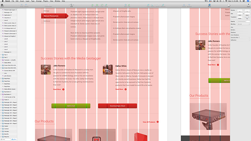
For our last 3 projects I’ve been using the new digital design tool from Bohemian Coding Sketch. Sketch looks to bridge the gap between traditional design software and the new technology that needs to be thought about when designing. It is a fairly new tool, and although they are on version 3.1 now, I find it still has a quite a few bugs. It is getting ever better and with wider adoption it has more and more resources available. I’ve enjoyed designing in Sketch as it has a lot of functionality that is built for designing digital products whether it be an app or a website. There isn’t too much of a learning curve if you are used to any other design software, and at $90 it’s not a huge financial burden either.
It still has the same issues as any design tool. With it is not using the browser you need multiple comps for breakpoints, you are designing an image of a website not a website, however even with these limitations it does make it easier than most design tools and I have been very happy with the results we’ve achieved using Sketch.
Future
Where does all this experimenting and testing leave us? That’s still up in the air, really. I do feel that designing functional HTML wireframes and designs is the way we should be designing. In my mind it makes the most sense, but as with most things we do, everything depends on the type of project and the client. So as it stands right now I think we have some very good effective options for designing modern websites and we will continue to adapt as technology demands.